
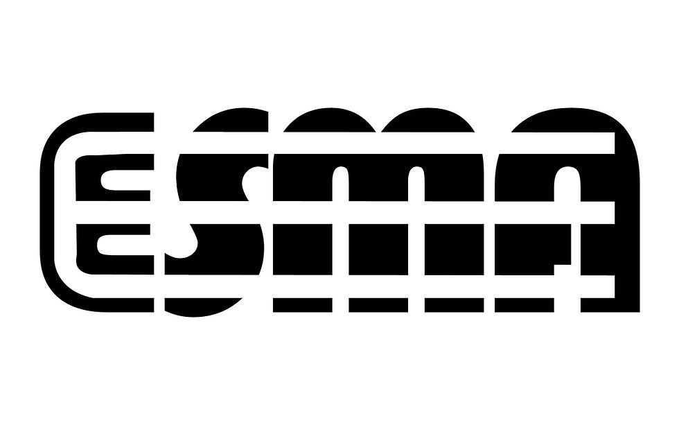
Ligature Logo
- Nov 29, 2016
- 1 min read


What is a ligature logo?
A ligature logo is when a logo for a company shows the letters representing them binded together in one way or another.
How would describe the corporate identity of ESMA in 5 words?
ESMA in five words?
Eclectic.
Sophisticated.
Mainstream.
Ace.
Incredible.
Which logo out of the two do you feel is the strongest and why?
I feel my first logo (building bridges) is my strongest. I feel that in both its design and color scheme it represents what I believe the identity of ESMA is. It’s sleek, yet not too suave; its modern, yet not futuristic.
If you had no requirements or restrictions how would your logo look different?
If there were no requirements, my designs would definitely have more color. I additionally think would have some more creative ideas that encompass the background, but don’t necessarily connect to each other (the letters) like they were required to.
Explain which ligature techniques you have demonstrated on each logo:
In my first design, I built bridges, use the white lines shot out of the “e” to go through the other three letters.
In my second design, I shared strokes, having all the letters connect to each other.


Comments