
Font Pairing Project
- Nov 8, 2016
- 3 min read


What does it mean to create a font pairing?
Font pairing means to match two or more fonts based off of their designs, styles, and stylistic elements. The pairing allows each font to shine individually, yet work cohesively just as well. Font pairings give emphasis to specific words based off of what font is used and what font is paired with it.
What are the four assignments you chose to do? Write the name of the assignment and describe your design for each.
I chose my favorite of my eight designs, being a location, a phrase about coffee, a saying, “These are the good ol’ days,” and another saying, “26 letters, endless possibilities.”
For my location design, I chose London, England. I’ve never been there but I’ve always been fascinated with the country. I used a picture of Big Ben, the large clock tower, with a warm sunset in the background, matched with a curly font and a thicker font.
For my coffee design, I chose to turn the given background upside down, as if the coffee beans were falling. I myself am an avid coffee drinker, so when I saw this choice, I knew I had to do it. And with that saying in mind, I expressed, “You can do it—Coffee.” I paired a slightly cursive font with simple serif font for contrast. I think my chosen phrase really describes the reason you just need coffee sometimes.
For my “These are the good ol’ days,” design, I followed the idea given for it to be vintage. I stayed with neutral, brown tones, and finished it off with a graphic of a vintage camera. I curved some words to kind of give the viewer a hug with the words, changing the font from bold to show that they are now, to simple, to script for emphasis.
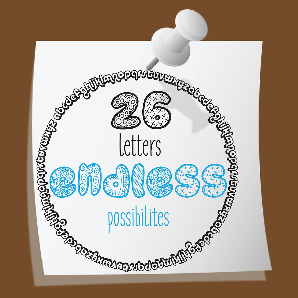
For my “26 letters, endless possibilities,” I really wanted the emphasis to be on 26 and endless. I used a zen-doodly font for my two words of emphasis, and a very simplistic, sans-serif font for the words letters and possibilities. I circled the entire design with the alphabet, all written on top of a post it note and attached to a corkboard with a thumbnail, just to represent a basic doodle someone made quickly.
Which assignment would you say is your BEST font pairing and why?
I would have to say my best font pairing is my “These are the good ol’ days.” It really encompasses everything the task was asking for, and the fonts just go really well together. Everything in it works, and it really is a cohesive design.
Which assignment would you say is your Least Successful font pairing and why?
I would say my least successful, yet my favorite, was my coffee design. I don’t think my design is necessarily bad at all, yet I feel with a similar design to others, it might not stand out.
How would you describe the font pairing process? What makes a font pairing so difficult?
The font pairing process is difficult, yet rewarding and fun. It’s difficult because so many pairings have already been created, yet you want to make one of your own that is original. It’s so much fun playing around with the different fonts, finding new texts, and creating something that is both appealing to the eye and attention grabbing.


Comments